How to put your Lettering over a Photo with Photoshop

Even the mention of Photoshop can be daunting because it is such a robust program. Photoshop is amazing, and I suggest learning as much as you can about it, but sometimes we just want to know one or two techniques specifically for lettering and calligraphy. Putting the design over a photo with blending modes is one way of digitizing your hand-lettering that is simple and versatile. I use this technique all the time to spice up my lettering pieces. I will take you step by step from original piece to finished composition, using blend modes, spot healing cleanup, and layering order. Don’t worry if you don’t know what that means. I’ll explain.
Let's gets started!
If you don't have Photoshop, you can download the free trial here
1) Scan or photograph your lettering
It’s best to scan your photo at 300 dpi but you can also take a photo of it. If you are going to take a photo, take it in good, indirect sunlight, like by a window. Be very still so the image doesn't come out blurry.
2) Open the photo in Photoshop. Go to navigation bar > File > Open

Bring the file into Photoshop
3) If your image needs rotating, go to top navigation bar > Image > Rotate. If you're anything like me, you will need to do this a couple times until you relearn the difference between clockwise and counter-clockwise.

Rotate the Image (if needed)
4) Unlock your layer so that you can make edits. If your layer is locked, there will be a lock icon on the right of it in the layers panel. The layers panel is on the right of your screen. To unlock it, click on the lock icon.

Unlock the Layer
5) Create a copy of your original lettering to have a backup. To duplicate the lettering layer left click on the layer > Duplicate Layer or you can click and drag while pressing option (⌥ drag) to make a copy.

Make a copy of the original Lettering
You always want to have a backup of the original image. This is just good practice. Label the duplicated layer "edits."
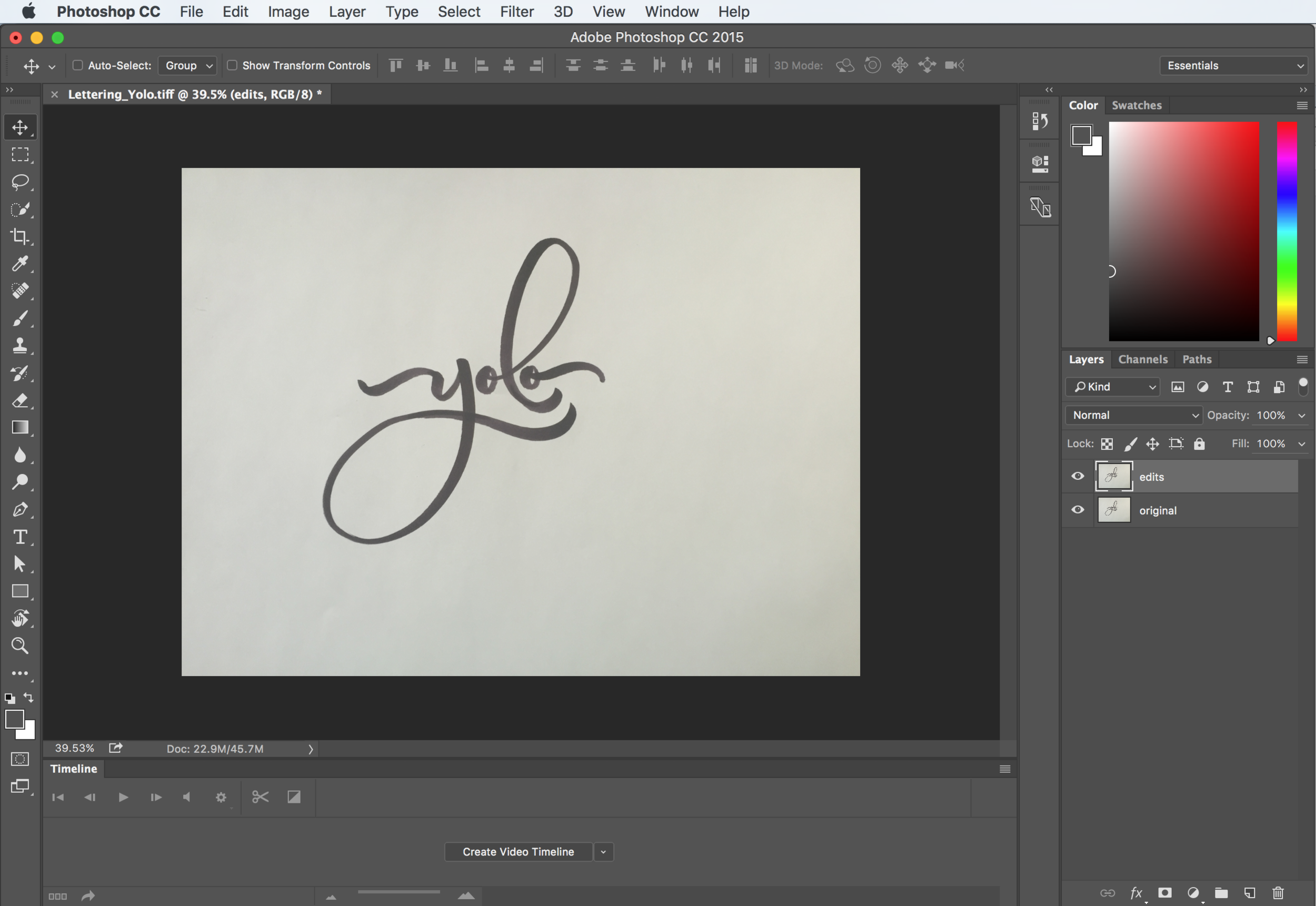
Label the Copied Layer "Edits"
6) Desaturate the image. Go to Image > Adjustment > Desaturate or ( ⌘⇧U )

Desaturate the Image (⌘⇧U)
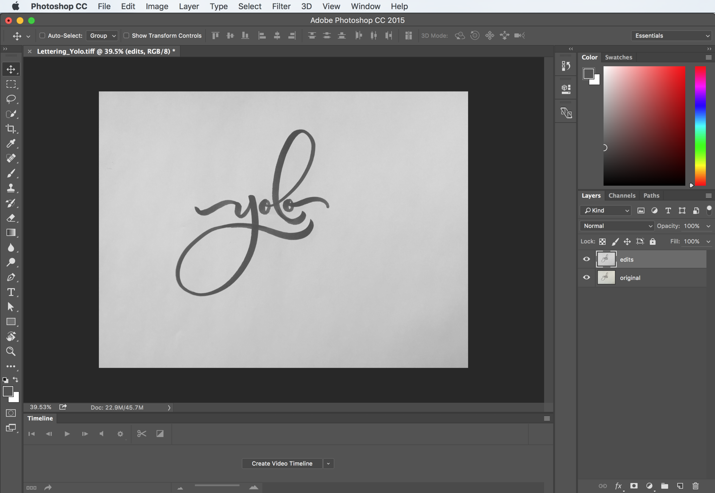
The desaturated image is now in greyscale
7) Adjust the levels to simplify the image. Go to Image > Adjustment > Levels or (⌘L)
Make sure to check the preview button so you can see the adjustments. Make the white brighter and the black darker by bringing the outer toggles in towards the middle.

Adjust the levels to brighten the white and darken the black
If you want to keep the brush stroke feel, you won’t want to make the black too dark, as the details will disappear.
8) Crop your photo to the ratio you want. Press (C) to bring up the crop tool. You can set the ratio in the ratio drop-down on the top bar. I will use 1:1 (square). Drag the corners out to resize the crop area. Re-position by clicking and dragging the image. Press ENTER to set the crop.

Crop your composition (C)
9) Clean up your lettering with the spot healing brush tool. If you’re happy with your lettering as is, you can skip this step. Get rid of any remaining blemishes, by going to to the spot healing tool in the left navigation bar or (J)
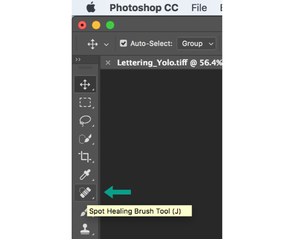
The Spot Healing Brush Tool is on the left navigation bar
Click and drag over the marks you want to get rid of.

Clean up stray marks with the Spot Healing Brush Tool (J)
10) Find a photo that you want to use. I use Unsplash often. Remember to always give credit to the Photographer. Thanks to Steve Carter for the awesome photo!
After you've found a photo, bring it into Photoshop by going to File > Place Embedded
The photo will have an X over it like this when placed.

The placed photo has and X mark over it
11) This means that it is editable. You can resize the photo by dragging the corners. Press shift and option (⌥⇧) at the same time as dragging to keep the photo in place and keeping the photo from becoming distorted. Set the image position by pressing ENTER.
If you aren't happy with the position or size of the image you can always resize it by clicking on the layer in the layers panel and going to Edit > Free Transform or (⌘T). You can then resize your image and move it.

Free Transform ( ⌘T )
12) The photo will be the only thing you can see now, so we will have to rearrange the layers. Go to the layers panel. Click on the image layer and drag it under the lettering layer.

Click on the image and drag under the Lettering
13) Set the blending mode to multiply. Click on your lettering layer (the top one). Next to "Opacity" you will see the word "Normal." That is the blend mode. Click on the arrow to the right of "Normal." Click on "Multiply"

Set the Blend Mode to Multiply
It should look something like this:

Lettering in Multiply Mode
As you can see, the multiply mode essentially ignores the white and shows the black. This is why we simplified the image to make the white "disappear."
14) You can keep it like this or you can make the lettering white. To make your lettering white, set the blending mode to Screen instead of Multiply.
It will look like this:

Set to screen mode
Now you can see Screen mode has the opposite effect. It ignores black instead of white. Seeing the image inside of the letters is a cool effect too.
15) To make the lettering white, you need to invert the image. To do this, click on the layer if it isn't already highlighted. Go to Image > Adjustment > Invert or (⌘I)

Invert the image after setting it to screen mode
16) If you want the lettering to be brighter, you can copy the layer (⌥ drag) and place on top of the layer to make it brighter and stand out more.

Brighten the letters by doubling the layers
I don't like it brighter because it loses the brushpen feel. So I'm going to keep it to one layer on top of the image. I'm going to delete the top layer by clicking on the layer and pressing delete.
17) You can edit the photo to compliment the lettering.
Most times you can leave the photo as is. Sometimes, I like to adjust the brightness, contrast, and saturation to make the lettering stand out more. Go to Image > Adjustments >Brightness/Contrast.

Adjust the brightness/contrast of the image
Bring the brightness down a little, and the contrast up a little to compliment the lettering.

Adjust the brightness and contrast to your liking
You can also play with the saturation by going to Image > Adjustment > Hue/Saturation or (⌘U). This is all up to you how you want the final piece to look.

Adjust the hue/saturation of the image

Adjust the hue and saturation to your liking

The final piece
BONUS TIP: ADD SHADOW TO YOUR LETTERING

Add shadow to your lettering
To create this effect, you will need to duplicate the lettering layer. On the second layer, use what we learned to invert the image (⌘I) and set to multiply mode. Keep this layer highlighted, and use the arrow keys to nudge the letters down and to the side or up and to the side so it looks like a drop shadow. In this example I nudged it over to the right and down. To make black letters with a white shadow, put the black letters on the top layer. You can change the opacity of either the white letters or black letters by sliding the opacity scale up or down while the layer is highlighted.