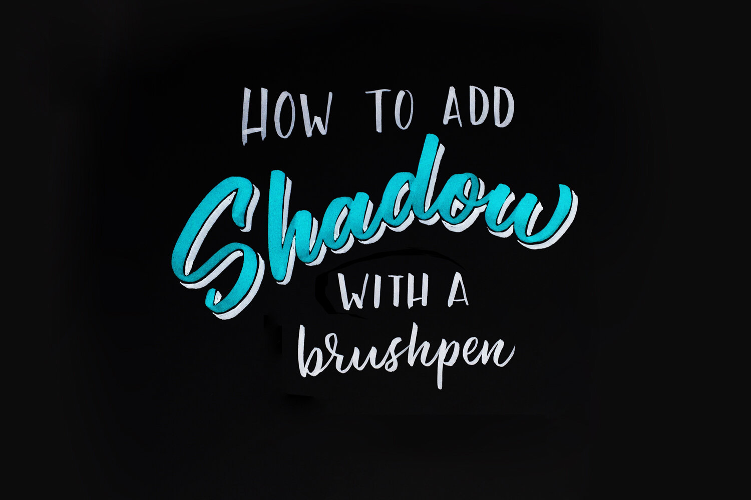
How to add Shadow with a Brush Pen
There are lots of ways to add shadow to lettering. Drawing the shadow with ink, pencil, chisel tip pen, paint, etc are perfectly good ways of adding dimension. Though, they can take quite a bit of time. Today I’d like to show you a couple ways to quickly and efficiently add dimension to your lettering using only brush pens.
You’ll need to know your way around a brush pen for best results. If you are new to a brush pen, keep practicing the basics, and this technique will come much more naturally. Creating dimension with the pen is much like creating a letter. However instead of redrawing the letters with the shadow color, you are outlining the letters.
BLACK SHADOW TECHNIQUE:
Here is a demonstration:

Here I use the Bic Visaquarelle for the red lettering, for the shadow I use the Zebra disposable brush pen fine and the Rhodia uni blank pad for the paper. Although you don't need these specific tools.
I like to use the smaller more sturdy brush tips to achieve the black shadow effect. Some good pens for this are the Zebra disposable medium or fine brush pens, the pilot pocket brush pen hard, and the Tombow Fudenosuke brush pen soft. The Tombow Fudenosuke brush pen hard is also good for smaller shadows. Whatever pen you use, the key is that you feel in control with the stiffness of the brush tip in order to achieve that consistent line.
Here is the finished product:

Black brushpen shadow/shade with offset.
The black shadow effect looks best when you use a color or lighter gray for the word. This way the shadow is more noticeable and stands out. This is true even for an offset effect. When I say offset, I mean that there is a space between the letters and their shadow. Another name for offset is relief, a term used by sign painters.
Here is an example of shadow or shade without the offset or relief shade effect:

Brushpen shadow/shade no offset
The key is shadow placement and consistent angles. The location of the light source dictates where the shadows are placed on the letters. Use the same angle with your brush pen to make sure each letter’s shadow remains consistent. In the example I provided the light is coming from the upper left, demonstrated here:

The placement of the light source dictates the the angles of the shadows. Consistency is key.
COLOR MIXING SHADOW TECHNIQUE:

Brushpen shadow / shade with lighter color
Here is a demonstration:

Here I'm using Bic Visaquarelle markers for both colors on Rhodia blank pad paper.
The color shadows effect is created by a darker color making up the lettering and a lighter color making up the shadow. You can see that this is a much looser technique, and, thus, a bit easier than the black shadow. The same principles of the black shadow technique apply here, but you don't have to be so careful not to touch the darker color. In fact you can overlap these colors as much as you want. This is true as long as you are using paper that isn't so slippery that the colors will be prone to smearing each other.
You will need to experiment with good color combinations. A good general rule is that colors that are two shades apart look good together. I skipped over the medium blue to the lighter blue when deciding what color to shade this word in royal blue.
OKAY, have fun with these techniques! Let me know if you have any questions in the comments of this video on Instagram. Please tag me @letteringcamp when using these techniques on Instagram. I would love to see what you come up with, and it will give me a chance to give you feedback!